How to read a p-value histogram from an RNA-seq differential expression analysis: the healthy, anti-conservative, conservative and U shapes, and each fix.
Author
Pseudocount
Published
8 September 2026
Setup: packages and helper functions
suppressPackageStartupMessages({library(DESeq2)library(ggplot2)})stopifnot(packageVersion("DESeq2") >="1.36", packageVersion("ggplot2") >="3.4.0")pct <-function(x, d =1) sprintf(paste0("%.", d, "f%%"), 100* x)num <-function(x) format(x, big.mark =",", scientific =FALSE, trim =TRUE)dec <-function(x, d =2) sprintf(paste0("%.", d, "f"), x)# negative binomial counts; phi is the dispersion (variance = mu + phi * mu^2)rnb <-function(mu, phi) { x <-rnbinom(length(mu), mu = mu, size =1/ phi)matrix(as.integer(x), nrow =nrow(mu))}# the DESeq2 standard workflow; returns the results table of the last coefficient# (alpha = 0.05 because genes are called at 5% FDR; the vignette asks for this when the cutoff is not 0.1)run_deseq <-function(counts, coldata, design) { dds <-DESeqDataSetFromMatrix(counts, coldata, design) dds <-DESeq(dds, quiet =TRUE)results(dds, name =tail(resultsNames(dds), 1), alpha =0.05)}# Storey's estimate of the null fraction with a single lambdapi0_hat <-function(p, lambda =0.5) mean(p > lambda) / (1- lambda)# what we can measure because the truth is knownscore <-function(p, is_de) { ok <-!is.na(p) p <- p[ok]; is_de <- is_de[ok] padj <-p.adjust(p, "BH") call <- padj <0.05list(n =length(p), null_p05 =mean(p[!is_de] <0.05), pi0_true =mean(!is_de),pi0_hat =pi0_hat(p), n_call =sum(call),fdp =if (any(call)) mean(!is_de[call]) else0,power =if (any(is_de)) mean(call[is_de]) elseNA_real_)}# histogram on the density scale, stacked by truth, dashed line at the true null fractionphist <-function(d) { d$bin <-cut(d$p, breaks =seq(0, 1, 0.05), include.lowest =TRUE) d$truth <-factor(ifelse(d$is_de, "truly changed", "null (no change)"),levels =c("truly changed", "null (no change)")) tab <-as.data.frame(table(panel = d$panel, bin = d$bin, truth = d$truth)) tot <-tapply(d$p, d$panel, length) tab$density <- tab$Freq / (as.numeric(tot[as.character(tab$panel)]) *0.05) tab$x <- (as.integer(tab$bin) -0.5) *0.05 line <-data.frame(panel =factor(names(tot), levels =levels(d$panel)),pi0 =as.numeric(tapply(!d$is_de, d$panel, mean)))ggplot(tab, aes(x, density, fill = truth)) +geom_col(width =0.05, colour ="white", linewidth =0.2) +geom_hline(data = line, aes(yintercept = pi0), linetype ="dashed",colour ="#d14fa6", linewidth =0.7) +scale_fill_manual(values =c("truly changed"="#5a3fc0", "null (no change)"="#b9b7c6"),name =NULL) +facet_wrap(~panel) +labs(x ="p-value", y ="density") +theme_minimal(base_size =12) +theme(legend.position ="bottom", panel.grid.minor =element_blank(),plot.background =element_rect(fill ="white", colour ="white"),strip.text =element_text(face ="bold"))}
You have run a differential expression analysis, drawn a histogram of the raw p-values, and it looks odd. Is that a problem? Usually yes, and the shape tells you which kind. A healthy histogram has a flat floor with a spike at zero. A floor that leans towards zero means the test is producing false positives: in the worst example below, 24.3% of genes with no change had p < 0.05, and 55.1% of the genes called at a 5% false discovery rate were false. A floor that leans towards one usually means the test is throwing power away, or that the histogram includes many genes with too few reads to test.
This post simulates RNA-seq counts where the truth is known, runs DESeq2 in four situations, and shows the histogram each one produces, what causes it, and how to fix it.
Why the histogram has a floor
A p-value is built so that, for a gene with no real change, every value between 0 and 1 is equally likely, as long as the model fits and the gene has enough reads. Test a few thousand unchanged genes and their p-values fill a histogram evenly: a flat floor. Genes that did change tend to give small p-values and stack up in the first bin. So a good histogram is a mixture of two parts, and the height of the floor tells you roughly what share of genes is null (unchanged).
That last point is the basis of Storey’s estimate of the null fraction, usually written (Storey and Tibshirani 2003). Take the share of p-values above 0.5 and divide by 0.5: if the right half of the histogram is made only of null genes, this recovers the share of null genes. The estimate is also a handy number for checking a histogram, because a true proportion cannot exceed 1. Breheny, Stromberg and Lambert (2018) give a longer treatment of both uses, inference and diagnosis.
The setup
Each simulated data set has 3,000 genes and 4 samples per condition, with counts drawn from a negative binomial distribution (the standard model for RNA-seq counts, where the variance grows faster than the mean). Mean expression varies over a realistic range, and the dispersion (the extra, biological part of the variance) is larger for weakly expressed genes. The first 10% of genes are truly changed, by a factor of two up or down; the rest are null.
Every analysis is the DESeq2 standard workflow, DESeq() then results() (Love, Huber and Anders 2014). The only thing that changes between scenarios is how the data were generated and which design formula is used. To score each run I apply the Benjamini-Hochberg adjustment to the raw p-values shown in the histogram and call genes at 5% FDR; because the truth is known, the share of false calls can be counted directly. The full simulation code is in the chunks below.
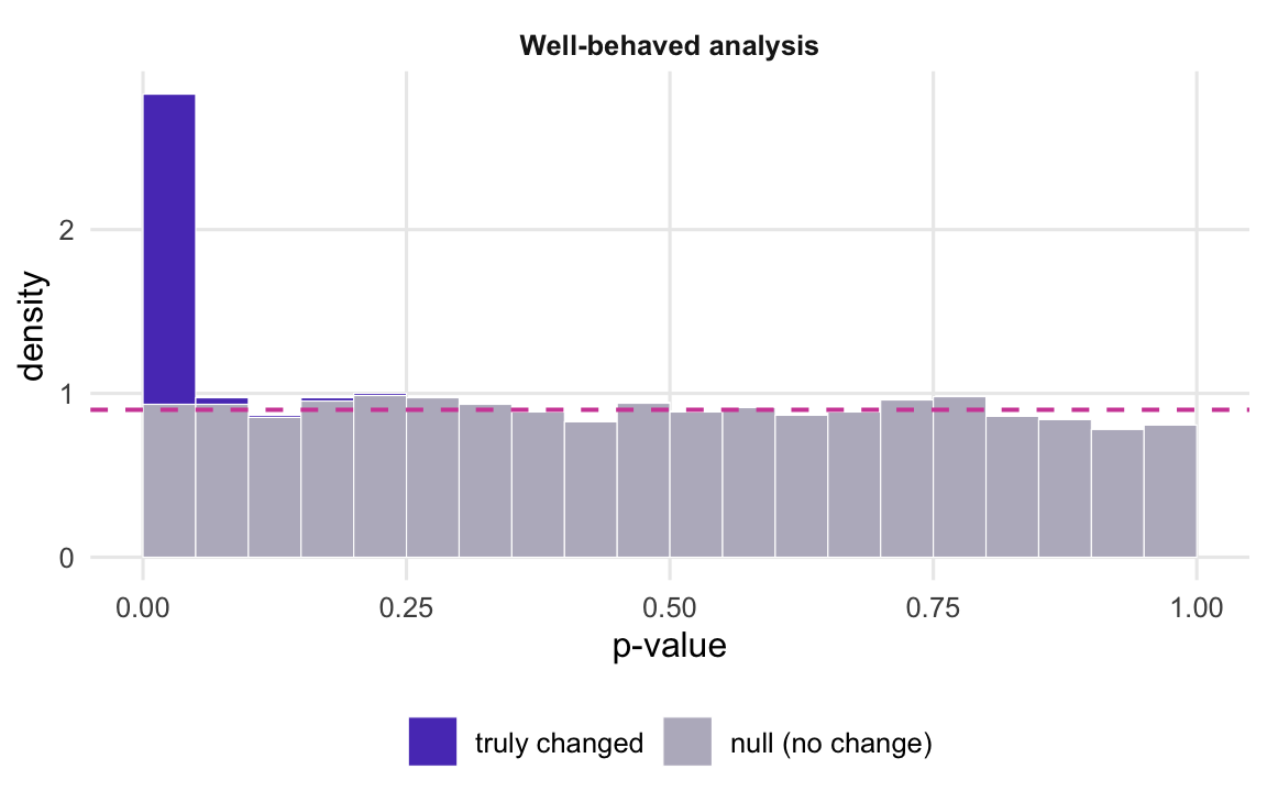
Figure 1: A healthy p-value histogram from DESeq2 on simulated data: a flat floor made of null genes and a spike at zero made of truly changed genes. The dashed line is the true fraction of null genes.
This is what you are hoping to see. The grey floor sits on the dashed line, and 5.2% of the null genes fall below 0.05, which is close to what a p-value promises. Storey’s estimate of the null fraction is 0.88 against a true value of 0.90. At 5% FDR the analysis calls 275 genes, finds 84.0% of the truly changed ones, and 8.4% of its calls are false. That last number is above the 5% target, for two reasons. Part of it is chance: the Benjamini-Hochberg procedure bounds the false discovery rate as an average over repeated experiments, not in every one. Part is that DESeq2’s Wald test is slightly liberal with 4 samples per group, as the 5.2% of nulls below 0.05 hints; repeated runs of this simulation put the false share a little above 5% on average. That excess is small next to Shape 1.
Shape 1: the floor leans towards zero
The most dangerous shape is a floor that is higher on the left than on the right. It means null genes are getting small p-values too often: the test is anti-conservative, and the false discovery rate you report is not the one you have.
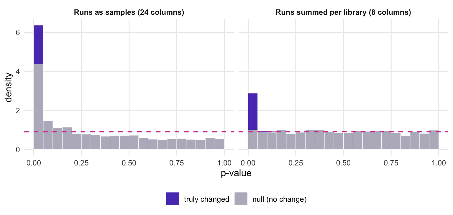
A common way to get there is to give the model a variance that is too small. Here each of the 8 biological samples was made into one library and sequenced on 3 lanes, and the lanes were then entered as 24 separate samples. Lanes of the same library differ only by sampling noise, so the model sees far less variation between “replicates” than there really is between animals or patients.
lanes <-3set.seed(2027)# one library per biological sample (its true expression), then 3 sequencing runs of itlambda <-matrix(rgamma(length(mu), shape =1/ phi, scale = mu * phi), nrow = n_genes)counts_tech <-do.call(cbind, lapply(seq_len(2* n_per), function(j)sapply(seq_len(lanes), function(l) rpois(n_genes, lambda[, j] / lanes))))rownames(counts_tech) <-rownames(counts)coldata_tech <-data.frame(condition =rep(condition, each = lanes),sample =factor(rep(seq_len(2* n_per), each = lanes)))# the mistake: every sequencing run treated as a separate sampleres_tech <-run_deseq(counts_tech, coldata_tech, ~ condition)s_tech <-score(res_tech$pvalue, is_de)# the fix: sum the runs of each library, then test 4 vs 4dds_tech <-DESeqDataSetFromMatrix(counts_tech, coldata_tech, ~ condition)dds_coll <-collapseReplicates(dds_tech, groupby = dds_tech$sample)res_coll <-results(DESeq(dds_coll, quiet =TRUE), alpha =0.05)s_coll <-score(res_coll$pvalue, is_de)
Figure 2: Technical replicates treated as biological replicates (left) against the same runs summed per library (right). The left panel is the anti-conservative shape: grey null genes pile up on the left and the floor on the right sinks below the dashed line. The dashed line is the true null fraction in each panel.
With the lanes as samples, 24.3% of null genes have p < 0.05 instead of about 5%. The analysis calls 643 genes at 5% FDR and 55.1% of them are false. Note the tell-tale detail on the right of the histogram: because too many null p-values have moved left, the floor near 1 drops below the dashed line, and Storey’s estimate falls to 0.56 against a true 0.90. The analysis also finds 96.3% of the truly changed genes, but that extra sensitivity is bought with the false calls. A null fraction estimate that is much lower than you would believe for your experiment is a warning in itself.
The fix is to give the model one column per biological unit. DESeq2 has a function for this case, collapseReplicates(), which sums the counts of columns that share a level of groupby; its help page defines technical replicates as multiple sequencing runs of the same library, and the vignette says not to use it on biological replicates. After collapsing, 5.5% of null genes fall below 0.05 and 7.9% of the calls are false.
Treating single cells as replicates in single-cell data is the same mistake as the lanes above, only larger (see pseudobulk versus cell-level tests). An unmodelled batch that is partly aligned with the condition gives the same lean for a different reason: part of the batch effect is attributed to the condition, so null genes look changed (see the post on confounded batches).
Shape 2: the floor leans towards one (low counts)
The opposite lean, more mass near 1 than near 0.5, means the test is conservative: null genes get p-values that are too large. That costs power rather than creating false positives, but it also breaks the histogram as a diagnostic, because the floor no longer tells you the null fraction.
A common cause in RNA-seq is harmless. Genes with a handful of reads carry almost no information about a change, and a test on them rarely produces a small p-value. To show it, I add 1,500 null genes with about one read per sample to the healthy data set and rerun the same analysis.
n_low <-1500set.seed(2028)mu_low <-exp(rnorm(n_low, log(1), 1)) # genes with about one read per samplecounts_low <-rbind(counts, rnb(outer(mu_low, size_factor), 0.05+0.5/ mu_low))rownames(counts_low) <-paste0("gene", seq_len(nrow(counts_low)))is_de_low <-c(is_de, rep(FALSE, n_low)) # the added genes are all nullres_low <-run_deseq(counts_low, coldata, ~ condition)s_low <-score(res_low$pvalue, is_de_low)n_low_na <-sum(is.na(res_low$pvalue))n_low_allzero <-sum(rowSums(counts_low) ==0)n_padj_low <-sum(res_low$padj <0.05, na.rm =TRUE) # DESeq2's own adjusted p-values# the DESeq2 vignette's pre-filter: a count of at least 10 in at least (smallest group size) sampleskeep <-rowSums(counts_low >=10) >= n_pers_kept <-score(res_low$pvalue[keep], is_de_low[keep])s_dropped <-score(res_low$pvalue[!keep], is_de_low[!keep])n_dropped <-sum(!keep)
lv <-c("Genes that fail the pre-filter", "Genes that pass the pre-filter")ok <-!is.na(res_low$pvalue)phist(data.frame(p = res_low$pvalue[ok], is_de = is_de_low[ok],panel =factor(ifelse(keep[ok], lv[2], lv[1]), lv)))
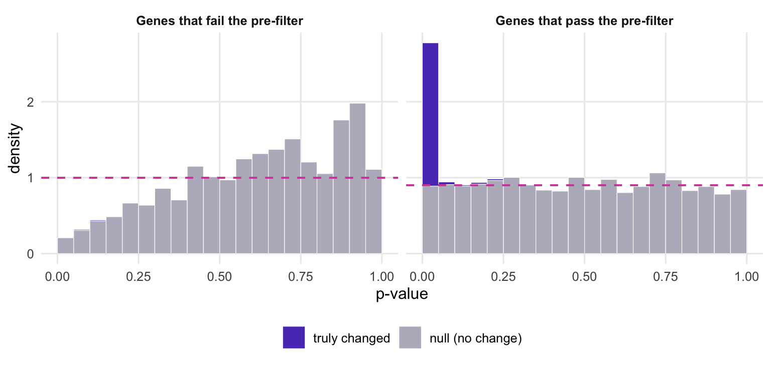
Figure 3: The same DESeq2 run, split by the DESeq2 vignette’s pre-filter. The genes that fail it (left) produce p-values that pile up towards 1; the genes that pass it (right) give the healthy shape. The dashed line is the true null fraction in each panel.
Across all genes, Storey’s estimate of the null fraction is now 1.04, an impossible value, against a true 0.93. The excess comes from a subset of genes, and splitting the histogram shows which. The DESeq2 vignette suggests keeping genes with a count of at least 10 in at least as many samples as the smallest group. Of the 1,509 genes that fail this filter, 65 have zero counts in every sample; DESeq2 leaves their p-value empty (missing), and the other 1,444 give the left panel: only 1.0% of their null p-values fall below 0.05, and their bars climb towards 1. The genes that pass give the healthy shape on the right, with 4.9% of nulls below 0.05 and a null fraction estimate of 0.89 (true value 0.90).
This shape needs a filter, not a new model. Filtering on a statistic computed without the condition labels, such as the overall mean count, is legitimate as long as the filter is (close to) independent of the test p-value for null genes (Bourgon, Gentleman and Huber 2010). DESeq2 already does this for its adjusted p-values: results() applies independent filtering on the mean of normalised counts by default and leaves padj missing for genes below the chosen threshold, and in this run its own padj column gives 268 genes at 5% FDR. What it does not do is filter the pvalue column, so a histogram of res$pvalue shows the tilt. Plot the genes that pass the filter.
Shape 3: a U, spike at zero and a ramp towards one
The third shape has a spike at zero, a dip, and then a floor that climbs towards 1. The ramp says null genes are getting p-values that are too large; the spike says some real signal is still getting through. If the ramp stays after you remove low-count genes, the problem is the model.
Here the data come from a paired design: 4 donors each give one control and one treated sample, and every gene has its own donor-to-donor differences. The common slip is to leave the donor out of the design formula.
donor <-factor(rep(seq_len(n_per), times =2)) # each donor gives one ctrl and one treated sampleset.seed(2029)donor_effect <-matrix(rnorm(n_genes * n_per, 0, 0.5), nrow = n_genes) # log2 scalecounts_pair <-rnb(mu *2^donor_effect[, as.integer(donor)], phi)rownames(counts_pair) <-rownames(counts)coldata_pair <-data.frame(condition = condition, donor = donor)res_unpaired <-run_deseq(counts_pair, coldata_pair, ~ condition)res_paired <-run_deseq(counts_pair, coldata_pair, ~ donor + condition)s_unpaired <-score(res_unpaired$pvalue, is_de)s_paired <-score(res_paired$pvalue, is_de)# is it the counts or the model? apply the same pre-filterkeep_pair <-rowSums(counts_pair >=10) >= n_pers_unpaired_kept <-score(res_unpaired$pvalue[keep_pair], is_de[keep_pair])
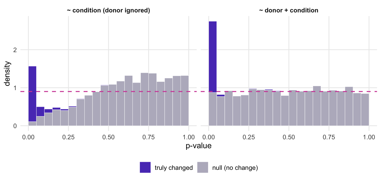
Figure 4: A paired design analysed without the donor term (left) and with it (right). Leaving the donor out gives the U shape: a spike at zero from the strongest changed genes and a ramp of null genes towards 1. The dashed line is the true null fraction in each panel.
Without the donor term, the differences between donors have nowhere to go but into the noise estimate, and the test becomes conservative: 0.6% of null genes fall below 0.05 and the null fraction estimate is 1.26. The price is power. At 5% FDR the analysis calls 8 genes and finds 2.7% of the truly changed ones. Restricting to the 2,968 genes that pass the count filter does not help (null fraction estimate 1.26), which is how you know this is not the low count shape.
With ~ donor + condition, each gene is compared within donors, and the histogram returns to the healthy shape: 4.9% of nulls below 0.05, 239 calls, 75.3% of changed genes found and 5.4% of calls false.
All seven analyses side by side
rows <-list("Well-behaved"= s_good,"Runs as samples"= s_tech, "Runs summed"= s_coll,"Low counts, all genes"= s_low, "Low counts, pre-filtered"= s_kept,"Paired, donor ignored"= s_unpaired, "Paired, donor in model"= s_paired)tab <-data.frame(analysis =names(rows),`nulls with p < 0.05`=sapply(rows, function(s) pct(s$null_p05)),`pi0 estimate (truth)`=sapply(rows, function(s) paste0(dec(s$pi0_hat), " (", dec(s$pi0_true), ")")),`calls at 5% FDR`=sapply(rows, function(s) num(s$n_call)),`false among calls`=sapply(rows, function(s) pct(s$fdp)),`changed genes found`=sapply(rows, function(s) pct(s$power)),check.names =FALSE, row.names =NULL)knitr::kable(tab, align ="lrrrrr")
analysis
nulls with p < 0.05
pi0 estimate (truth)
calls at 5% FDR
false among calls
changed genes found
Well-behaved
5.2%
0.88 (0.90)
275
8.4%
84.0%
Runs as samples
24.3%
0.56 (0.90)
643
55.1%
96.3%
Runs summed
5.5%
0.88 (0.90)
265
7.9%
81.3%
Low counts, all genes
3.6%
1.04 (0.93)
256
6.6%
79.7%
Low counts, pre-filtered
4.9%
0.89 (0.90)
271
8.1%
83.6%
Paired, donor ignored
0.6%
1.26 (0.90)
8
0.0%
2.7%
Paired, donor in model
4.9%
0.93 (0.90)
239
5.4%
75.3%
What to do in practice
Make the histogram every time, before you look at the gene list, and split it by expression so that the low-count tilt cannot hide a real problem or pass for one. With DESeq2 the split can reuse the threshold that independent filtering chose, which is how the DESeq2 vignette draws its own p-value histogram:
res <- res_low # your results() tableuse <- res$baseMean >metadata(res)$filterThresholdpi0_split <-c(pass =pi0_hat(na.omit(res$pvalue[use])),fail =pi0_hat(na.omit(res$pvalue[!use])))pi0_split
     pass      fail
0.9033694 1.3716059
hist(res$pvalue[use], breaks =0:20/20, main ="genes passing the filter")hist(res$pvalue[!use], breaks =0:20/20, main ="genes filtered out")
On the low-count data set from above, the null fraction estimate is 0.90 for the genes that pass this threshold and 1.37 for those that fail it.
Then read the part of the histogram that passes the filter. A flat floor with a spike is fine. A floor leaning towards zero, or a null fraction estimate far below what you believe, points to replicates that are not independent (sequencing runs or cells entered as samples) or to a batch partly aligned with the condition. A floor leaning towards one that survives the filter points to a donor or batch, balanced across conditions, that is in the experiment but missing from the formula.
References
Storey JD, Tibshirani R 2003 Proceedings of the National Academy of Sciences 100(16):9440-9445 (doi:10.1073/pnas.1530509100)