Double dipping: marker gene p-values after clustering
scRNA-seq
clustering
marker genes
scanpy
Why are marker gene p-values after clustering so small? A simulation of double dipping in scRNA-seq, and what sample splitting and count splitting do about it.
Author
Pseudocount
Published
18 September 2026
Setup: packages and helper functions
suppressPackageStartupMessages({library(SingleCellExperiment)library(scuttle)library(scran)library(bluster)library(edgeR)library(ggplot2)})stopifnot(packageVersion("SingleCellExperiment") >="1.24.0",packageVersion("scuttle") >="1.12.0", packageVersion("scran") >="1.30.0",packageVersion("bluster") >="1.12.0", packageVersion("edgeR") >="4.0.0",packageVersion("ggplot2") >="3.4.0")fmt_pct <-function(x, d =0) sprintf(paste0("%.", d, "f%%"), 100* x)fmt_int <-function(x) format(round(x), big.mark =",", trim =TRUE)fmt_num <-function(x, d =1) sprintf(paste0("%.", d, "f"), x)fmt_p <-function(p) sprintf("%.0e", p)fmt_rng <-function(v) if (min(v) ==max(v)) fmt_int(min(v)) elsepaste(fmt_int(min(v)), "to", fmt_int(max(v)))fmt_prng <-function(v, d =1) if (round(min(v), d +2) ==round(max(v), d +2))fmt_pct(min(v), d) elsepaste(fmt_pct(min(v), d), "to", fmt_pct(max(v), d))fmt_of <-function(a, k, noun, all ="All") if (a == k) paste(all, k, noun) elsepaste(a, "of the", k, noun)fmt_n <-function(n, noun) if (n ==0) paste0("no ", noun, "s") elsepaste(fmt_int(n), if (n ==1) noun elsepaste0(noun, "s"))alpha <-0.05# p-value and FDR thresholdviolet <-"#5a3fc0"; grey <-"#8a8799"theme_set(theme_minimal(base_size =12) +theme(panel.grid.minor =element_blank(),plot.background =element_rect(fill ="white", colour =NA),strip.text =element_text(face ="bold")))
You cluster your cells, ask for the marker genes of each cluster, and every cluster comes back with genes whose p-values are so small they print in scientific notation. It is tempting to read them as proof that the clusters are real. So the question people type into a search box is: why are my marker p-values so small, and can I trust them?
You cannot, because the same data were used twice: once to draw the cluster boundaries and once to test whether the clusters differ. In 2,000 simulated cells from a single population, with no clusters at all, graph-based clustering found 10 clusters, and a Wilcoxon test of each cluster against the rest called on average 21.5 genes per cluster significant at a false discovery rate (FDR) of 5%. Every one of them is a false positive. Splitting each count into two independent halves, clustering on one and testing on the other, removes the reuse, provided the test on the held-out half also accounts for each cell’s sequencing depth, which both halves share.
The setup
simulate_cells <-function(n_cells =2000, n_genes =1000, phi =0, sf_sd =0.3,n_sub =0, n_marker =0, fold =1) { mu <-exp(rnorm(n_genes, 0, 1)) # mean UMI per cell, per gene sf <-exp(rnorm(n_cells, 0, sf_sd)) # capture efficiency, per cell m <-outer(mu, sf) sub <-seq_len(n_cells) <= n_sub # optional real subpopulation m[seq_len(n_marker), sub] <- fold * m[seq_len(n_marker), sub] x <-if (phi ==0) rpois(length(m), m) elsernbinom(length(m), mu = m, size =1/ phi)matrix(x, n_genes, dimnames =list(sprintf("g%04d", seq_len(n_genes)),sprintf("c%04d", seq_len(n_cells))))}set.seed(1)counts <-simulate_cells()n_genes <-nrow(counts); n_cells <-ncol(counts)sf_sd <-formals(simulate_cells)$sf_sdshare_low <-mean(rowMeans(counts) <1)
The simulated data set has 2,000 cells and 1,000 genes. Each gene has a baseline level (48% of genes average less than one UMI per cell; a UMI, or unique molecular identifier, is one captured mRNA molecule). Each cell has a capture efficiency that scales all its counts up or down, with a standard deviation of 0.3 on the natural log scale; this is what makes cells differ in sequencing depth. Counts are Poisson around the product of the two. Every cell comes from the same distribution, so any gene called a marker is a false positive. The Poisson noise is the assumption that matters most, and a later section replaces it with negative binomial noise.
The common way: cluster, then test the clusters
as_sce <-function(counts) logNormCounts(SingleCellExperiment(list(counts = counts)))cluster_pipeline <-function(counts, n_hvg =500, n_pc =10) { sce <-as_sce(counts) hvg <-getTopHVGs(modelGeneVar(sce), n = n_hvg) sce <-fixedPCA(sce, rank = n_pc, subset.row = hvg)metadata(sce)$hvg <- hvg sce$cluster <-clusterCells(sce, use.dimred ="PCA") # SNN graph + walktrap sce}# each cluster against all other cells: a Wilcoxon rank-sum p-value per genemarkers_vs_rest <-function(sce, cluster) {sapply(levels(cluster), function(k) { in_k <-factor(ifelse(cluster == k, "in", "out"))findMarkers(sce, groups = in_k, test.type ="wilcox")$`in`[rownames(sce), "p.value"] })}# per cluster: how many genes pass a Benjamini-Hochberg FDR of alphan_markers <-function(P) colSums(apply(P, 2, p.adjust, method ="BH") < alpha)
p_nn <-NNGraphParam() # what clusterCells() uses by defaultc(class =class(p_nn)[1], k = p_nn@k, type = p_nn@type, cluster.fun = p_nn@cluster.fun)
          class               k            type     cluster.fun
"SNNGraphParam"            "10"          "rank"      "walktrap"
# the default test: findMarkers() without test.type gives the same p-values as test.type = "t"g2 <-factor(ifelse(sce$cluster ==levels(sce$cluster)[1], "in", "out"))same_as_t <-identical(findMarkers(sce[1:20, ], groups = g2)$`in`$p.value,findMarkers(sce[1:20, ], groups = g2, test.type ="t")$`in`$p.value)c(default_is_t = same_as_t)
default_is_t
        TRUE
The pipeline is the standard Bioconductor one: log-normalise with logNormCounts(), keep the most variable genes, reduce them to 10 principal components, and cluster with clusterCells(), whose default builds a shared nearest-neighbour graph from the 10 nearest neighbours of each cell and splits it with the walktrap algorithm (output above); Seurat and scanpy do the same with Louvain or Leiden. For markers, findMarkers() compares each cluster with all other cells using test.type = "wilcox", a two-sided Wilcoxon rank-sum test (its default is a t-test, as the check shows; Seurat’s FindMarkers() defaults to the Wilcoxon test), with Benjamini-Hochberg adjustment within each cluster.
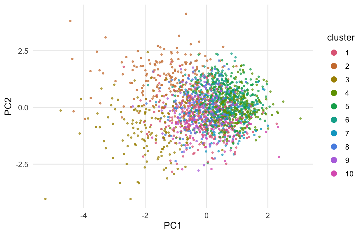
The clustering found 10 clusters in data that has none. Figure 1 shows them on the first two principal components: one continuous cloud of cells, cut into pieces.
Figure 1: The simulated cells on the first two principal components, coloured by the clusters that graph-based clustering found. The cells come from a single population; the clusters are pieces of one cloud.
All 10 clusters got marker genes at an FDR of 5%, between 6 and 49 per cluster, with a smallest p-value of 1e-19. Across every gene and every cluster, 12% of the raw p-values fell below 0.05, where a valid test on null data gives 5%.
Why it happens
A clustering algorithm has one job: find groups of cells that differ in expression. In data without structure, noise still makes some cells a little higher in some genes and a little lower in others, and the algorithm puts its boundaries where those chance differences line up best. The marker test then asks whether the groups differ. They do, because that is how the groups were chosen.
The p-value of a Wilcoxon test (or a t-test) assumes the groups were fixed before anyone looked at the data. Here they were chosen from the same counts that are then tested: the data are used once to pick the hypothesis and again to test it. Zhang, Kamath and Tse (2019) describe this for single-cell clustering: because clustering forces the groups apart, reusing the data gives artificially low p-values. They also propose a corrected test.
The inflation sits where the clustering looked. Among the 352 variable genes that went into the principal components (getTopHVGs() was asked for up to 500 but by default keeps only genes above the fitted mean-variance trend), 21% of the p-values fell below 0.05; among the other genes, 7%.
The clustering also picked up something real, if uninteresting: sequencing depth. The first principal component correlates with the log of each cell’s total count (correlation 0.68), and the clusters account for 33% of the variance in log total count. Log-normalisation does not remove depth completely (a cell with fewer counts has more zeros), so clusters that differ in depth also differ a little in the normalised values of every gene, which is the likely reason the genes the clustering never used came out at 7% rather than 5%. This matters again below.
The tempting fix: split the cells
# assign held-out cells to the nearest cluster centre in the training PCA spaceassign_heldout <-function(train_sce, test_sce) { hvg <-metadata(train_sce)$hvg rot <-attr(reducedDim(train_sce, "PCA"), "rotation")[hvg, ] centre <-rowMeans(as.matrix(logcounts(train_sce)[hvg, ])) z <-t(as.matrix(logcounts(test_sce)[hvg, ]) - centre) %*% rot cent <-rowsum(reducedDim(train_sce, "PCA"), train_sce$cluster) /as.vector(table(train_sce$cluster)) d2 <-outer(rowSums(z^2), rowSums(cent^2), "+") -2* z %*%t(cent)factor(rownames(cent)[max.col(-d2)], levels =rownames(cent))}set.seed(2)half <-sample(n_cells, n_cells /2)sce_a <-cluster_pipeline(counts[, half]) # cluster on half Asce_b <-as_sce(counts[, -half]) # test on half Bcl_b <-droplevels(assign_heldout(sce_a, sce_b))p_cells <-markers_vs_rest(sce_b, cl_b)
The textbook answer is to use different data for the two steps: cluster half of the cells, test in the other half. But the held-out cells have no cluster labels, and the only way to give them one is from their own expression (above: project each onto the training principal components and pick the nearest cluster centre, the idea behind label transfer).
That puts the circularity back. Half A gave 7 clusters; in half B, 7 of them got markers, 6.7 per cluster on average, with a smallest p-value of 2e-09, and 9% of the raw p-values were below 0.05. Half as many cells means less power, but the share of small p-values stays well above 5%, because each held-out cell was sorted into a cluster by the genes that are then tested. Neufeld et al. (2024) make the same point: sample splitting, the usual remedy elsewhere, does not apply here.
Count splitting, and the depth both halves share
count_split <-function(counts, eps =0.5, phi =NULL) { p <- eps # Poisson: binomial thinningif (!is.null(phi)) { # negative binomial: beta-binomial b <-rep(1/pmax(phi, 1e-8), ncol(counts)) p <-rbeta(length(counts), eps * b, (1- eps) * b) } train <-matrix(rbinom(length(counts), counts, p), nrow(counts),dimnames =dimnames(counts))list(train = train, test = counts - train)}# negative binomial GLM in edgeR; the offset is each cell's log total count (no TMM)nb_vs_rest <-function(counts, cluster, clusters =levels(cluster)) { design <-model.matrix(~0+ cluster) fit <-glmQLFit(DGEList(counts), design, legacy =FALSE) K <-nlevels(cluster)sapply(clusters, function(k) { # cluster k against the mean of the others con <-ifelse(levels(cluster) == k, 1, -1/ (K -1))glmQLFTest(fit, contrast = con)$table$PValue })}set.seed(3)cs <-count_split(counts)sce_train <-cluster_pipeline(cs$train) # cluster on the training countssce_test <-as_sce(cs$test) # test on the held-out countsp_split <-markers_vs_rest(sce_test, sce_train$cluster)p_split_nb <-nb_vs_rest(cs$test, sce_train$cluster)
Count splitting (Neufeld et al. 2024) splits the counts instead of the cells. Every UMI is sent to a training copy or a test copy by a coin flip: for a count , the training count is binomial with trials and probability 0.5, and the rest goes to the test copy. If the original count is Poisson, the two copies are independent Poisson counts. Both copies contain every cell, so the clusters found on the training copy label the same cells in the test copy, and the test copy had no say in where the boundaries went. The whole pipeline runs on the training counts; only the marker test uses the test counts.
Independence covers the noise, not what the copies share: both copies of a cell inherit its capture efficiency, so clusters that follow depth in the training copy differ in depth in the test copy too, and a Wilcoxon test on log-normalised values can see that. A test that models the counts with each cell’s total count as an offset does not: nb_vs_rest() above fits edgeR’s negative binomial quasi-likelihood model (with legacy = FALSE, glmQLFit() estimates the negative binomial dispersion itself, so no estimateDisp() step is needed) and compares each cluster with the average of the others.
clusterings <-list("walktrap, k = 10"=NNGraphParam(k =10),"Louvain, k = 20"=NNGraphParam(k =20, cluster.fun ="louvain"))wide_sd <-0.5# a wider spread of sequencing depthr2 <-function(y, cl) summary(lm(y ~ cl))$r.squaredset.seed(6)runs <-list(); per_cluster <-list()for (job inlist(c(sf_sd, 1), c(sf_sd, 2), c(wide_sd, 1))) { d <- job[1]; s <- job[2]if (d == sf_sd && s ==1) { cs_s <- cs; tr <- sce_train } else { cs_s <-count_split(simulate_cells(sf_sd = d)) tr <-cluster_pipeline(cs_s$train) } te <-as_sce(cs_s$test)for (j inseq_along(clusterings)) { cl <-if (j ==1) tr$cluster elseclusterCells(tr, use.dimred ="PCA", BLUSPARAM = clusterings[[j]]) main <- d == sf_sd && s ==1&& j ==1 p_w <-if (main) p_split elsemarkers_vs_rest(te, cl) run_nb <- j ==1&& s ==1# edgeR is slow: first clustering only p_e <-if (main) p_split_nb elseif (run_nb) nb_vs_rest(cs_s$test, cl) elseNULL runs[[length(runs) +1]] <-data.frame(depth_sd = d, data_set = s, clustering =names(clusterings)[j], clusters =nlevels(cl),depth_R2 =round(r2(log(colSums(cs_s$test)), cl), 2),wilcox_markers =sum(n_markers(p_w)), wilcox_p_below =round(mean(p_w < alpha), 3),edgeR_markers =if (run_nb) sum(n_markers(p_e)) else-1,edgeR_p_below =if (run_nb) round(mean(p_e < alpha), 3) else-1) per_cluster[[length(per_cluster) +1]] <-rbind(data.frame(depth_sd = d, test ="Wilcoxon", n =n_markers(p_w)),if (run_nb) data.frame(depth_sd = d, test ="edgeR", n =n_markers(p_e))) }}runs <-do.call(rbind, runs); per_cluster <-do.call(rbind, per_cluster)lo <- runs[runs$depth_sd == sf_sd, ]; hi <- runs[runs$depth_sd == wide_sd, ]nb_runs <- runs[runs$edgeR_markers >=0, ]
The table repeats the count split on 2 data sets with the depth spread used so far (0.3) and one with a wider spread (0.5), each training copy clustered in 2 ways; depth_R2 is the share of variance in the test copy’s log total count that the clusters account for. At the narrower spread the clusters accounted for 20% to 22% of it, and the Wilcoxon test gave 11 to 39 marker genes per clustering, with 8.2% to 9.7% of p-values below 0.05. Small counts like these move around with the clustering, the seed and the package versions. At the wider spread they accounted for 51% to 53%, and the Wilcoxon test gave 1,688 to 1,703 marker genes per clustering, with 59% to 62% of p-values below 0.05. The copies share nothing else, so those markers come from depth, not from double dipping. The edgeR model, run on the first clustering of the first data set at each spread, gave 0 marker genes per clustering in the runs shown, with 5.0% to 5.1% of p-values below 0.05. Over other clusterings it will sometimes report a few markers, about as many as Benjamini-Hochberg lets through by chance when nothing is there (a false marker in up to about 5% of clusters), at either depth spread.
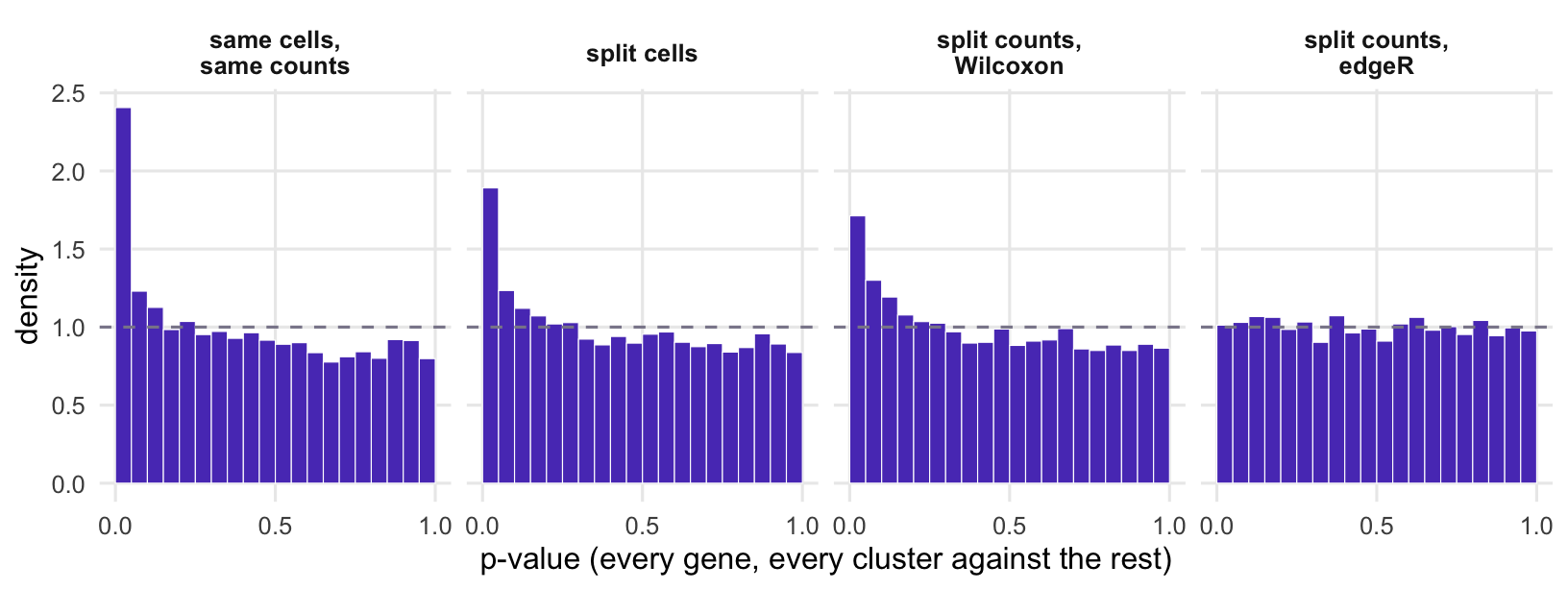
lab_p <-c("same cells,\nsame counts", "split cells", "split counts,\nWilcoxon","split counts,\nedgeR")dp <-rbind(data.frame(approach = lab_p[1], p =as.vector(p_naive)),data.frame(approach = lab_p[2], p =as.vector(p_cells)),data.frame(approach = lab_p[3], p =as.vector(p_split)),data.frame(approach = lab_p[4], p =as.vector(p_split_nb)))dp$approach <-factor(dp$approach, levels = lab_p)ggplot(dp, aes(p)) +geom_histogram(aes(y =after_stat(density)), breaks =seq(0, 1, 0.05),fill = violet, colour ="white", linewidth =0.2) +geom_hline(yintercept =1, linetype ="dashed", colour = grey) +facet_wrap(~ approach, nrow =1) +scale_x_continuous(breaks =c(0, 0.5, 1)) +labs(x ="p-value (every gene, every cluster against the rest)", y ="density")
Figure 2: P-values from testing each cluster against the rest, for every gene, in the data with no real clusters (narrower depth spread, default clustering). A valid test gives a flat histogram (dashed line). Testing on the cells and counts used for clustering, or on held-out cells, piles p-values up near zero.
Count splitting does not stop the algorithm from finding clusters in noise (the training copy was still cut into 8 pieces); it makes the tested noise different from the noise that drew the boundaries. In real data, batch, cell cycle and anything else that differs between cells sits in both copies, like depth here, and belongs in the test’s model too.
The assumption that matters: Poisson noise
# method-of-moments negative binomial overdispersion, one value per genenb_dispersion <-function(counts) { sf <-colSums(counts) /mean(colSums(counts)) m <-outer(rowSums(counts) /sum(sf), sf)pmax(rowSums((counts - m)^2- m) /rowSums(m^2), 0)}phi_nb <-0.5set.seed(4)counts_nb <-simulate_cells(phi = phi_nb)phi_hat <-nb_dispersion(counts_nb)cs_pois <-count_split(counts_nb) # assumes Poissontr_pois <-cluster_pipeline(cs_pois$train)p_nb_pois <-markers_vs_rest(as_sce(cs_pois$test), tr_pois$cluster)cs_nb <-count_split(counts_nb, phi = phi_hat) # uses the estimated overdispersiontr_nb <-cluster_pipeline(cs_nb$train)p_nb_nb <-markers_vs_rest(as_sce(cs_nb$test), tr_nb$cluster)
Independence of the two copies holds for Poisson counts. Real UMI counts are often more variable (overdispersed, usually modelled as negative binomial). Then a cell with a burst of one gene has a high count in both copies, the copies are positively correlated, and double dipping comes back through those genes. The next simulation gives every gene negative binomial noise with overdispersion 0.5 (variance = mean + 0.5 x mean squared) and still no clusters. After a Poisson split, 7 of the 8 training clusters got markers in the test copy, 22 in total, with a smallest p-value of 1e-31 (against 1e-19 for the same-data analysis on Poisson data). Only 6.4% of all raw p-values were below 0.05, so the damage sits in a few genes with extreme p-values that a histogram can hide.
The fix is a split that matches the noise. Draw the thinning probability for each count from a beta distribution set by the overdispersion, then split binomially with it. Seen as a Poisson count whose mean varies from cell to cell, this divides the varying mean itself into two independent parts, and the copies are independent negative binomial counts again (the phi branch of count_split()). With per-gene overdispersion estimated by the method of moments (median 0.49, true value 0.5), the test copy gave no marker genes across 9 clusters. Both analyses here use the Wilcoxon test to keep the run short; the narrower-spread rows of the table show what depth alone adds at this spread. The estimate must be right in both directions: too small leaves the copies positively correlated, too large makes them negatively correlated.
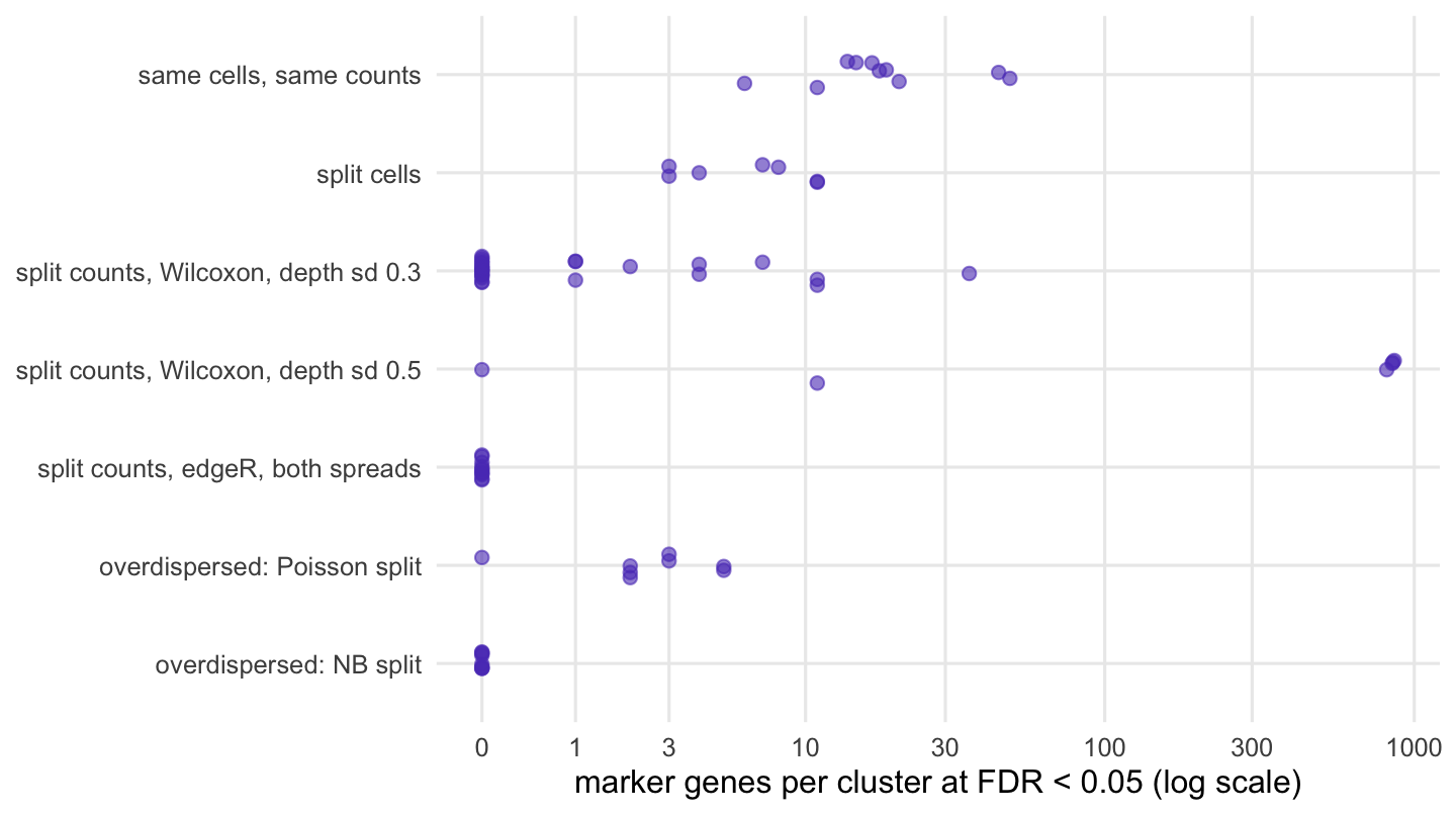
lab_m <-c("same cells, same counts", "split cells",paste("split counts, Wilcoxon, depth sd", fmt_num(sf_sd)),paste("split counts, Wilcoxon, depth sd", fmt_num(wide_sd)),"split counts, edgeR, both spreads","overdispersed: Poisson split", "overdispersed: NB split")pc <-function(test, d =c(sf_sd, wide_sd)) per_cluster$n[per_cluster$test == test & per_cluster$depth_sd %in% d]dm <-rbind(data.frame(approach = lab_m[1], n =n_markers(p_naive)),data.frame(approach = lab_m[2], n =n_markers(p_cells)),data.frame(approach = lab_m[3], n =pc("Wilcoxon", sf_sd)),data.frame(approach = lab_m[4], n =pc("Wilcoxon", wide_sd)),data.frame(approach = lab_m[5], n =pc("edgeR")),data.frame(approach = lab_m[6], n =n_markers(p_nb_pois)),data.frame(approach = lab_m[7], n =n_markers(p_nb_nb)))dm$approach <-factor(dm$approach, levels =rev(lab_m))ggplot(dm, aes(n, approach)) +geom_point(position =position_jitter(width =0, height =0.15, seed =1),size =2, alpha =0.6, colour = violet) +scale_x_continuous(trans ="log1p", breaks =c(0, 1, 3, 10, 30, 100, 300, 1000)) +labs(x =paste("marker genes per cluster at FDR <", alpha, "(log scale)"), y =NULL)
Figure 3: Marker genes per cluster in data with no real clusters; each point is one cluster, on a log scale. The split-counts rows pool the clusters of the repeated runs in the table; the other rows are single runs.
Halving the counts costs information, so does a real cluster survive? The last simulation adds one: 200 of the 2,000 cells express 30 genes at 3 times the baseline level. The training copy put 100.0% of them in one cluster (which was 100% subpopulation cells), and the edgeR test on the test copy found 30 of the 30 markers. A clear subpopulation stays clear with half the counts; a subtle one may not, and that is the price of an honest p-value.
The test also flagged 11 other genes for that cluster, 11 of them lower there than elsewhere. That is the known weakness of a total-count offset (composition bias): the subpopulation’s extra RNA from its 30 marker genes raises its total count, so every other gene’s share of it falls. Many strongly up-regulated genes in one cluster will do this with any total-count normalisation.
The script below runs one null simulation through the usual scanpy steps, ending in rank_genes_groups with the Wilcoxon test against the rest and the tie correction switched on (its default is tie_correct = False) to match the R test. The numbers come from scanpy 1.11.5 and a different random generator. Leiden found 16 clusters, 16 of them with markers (16.7 per cluster on average, 12% of raw p-values below 0.05). After a Poisson count split, 3 of 16 clusters had a marker (0.44 per cluster) and 6.2% of raw p-values were below 0.05; with a Wilcoxon test on log-normalised values, the depth effect described above is the likely source of those.
# Double dipping in scanpy: cluster cells from ONE population, then test markers between clusters.# Same design as the R code in the post: 2,000 cells, 1,000 genes, Poisson counts, no clusters.# Writes double_dipping_check-results.csv (columns name,value).from importlib.metadata import versionimport anndata as adimport numpy as npimport pandas as pdimport scanpy as scrng = np.random.default_rng(2026)n_cells, n_genes =2000, 1000mu = np.exp(rng.normal(0.0, 1.0, n_genes)) # gene means, UMI per cellsf = np.exp(rng.normal(0.0, 0.3, n_cells)) # capture efficiency per cellcounts = rng.poisson(sf[:, None] * mu[None, :]) # cells x genes, one populationgenes = [f"g{i +1:04d}"for i inrange(n_genes)]cells = [f"c{i +1:04d}"for i inrange(n_cells)]def make(x): a = ad.AnnData(X=x.astype(np.float32), obs=pd.DataFrame(index=cells), var=pd.DataFrame(index=genes)) sc.pp.normalize_total(a) # default: scale to the median total count sc.pp.log1p(a)return adef cluster(a): sc.pp.highly_variable_genes(a, n_top_genes=500) sc.pp.pca(a, n_comps=10, mask_var="highly_variable") sc.pp.neighbors(a, random_state=0) sc.tl.leiden(a, flavor="igraph", n_iterations=2, directed=False, random_state=0)return a.obs["leiden"]def markers(a, labels): a.obs["cl"] = labels.values# each cluster vs rest; tie_correct=True to match the R test (scanpy's default is False) sc.tl.rank_genes_groups(a, "cl", method="wilcoxon", tie_correct=True) df = sc.get.rank_genes_groups_df(a, group=None) per = df.groupby("group", observed=True)["pvals_adj"].apply(lambda q: np.sum(q <0.05))return {"n_clusters": int(labels.nunique()),"fpr": float(np.mean(df["pvals"] <0.05)),"markers_per_cluster": float(per.mean()),"clusters_with_marker": int(np.sum(per >0))}# 1. the common way: cluster and test on the same cells and countsadata = make(counts)naive = markers(adata, cluster(adata))# 2. count splitting: Poisson thinning, cluster on train, test on testtrain = rng.binomial(counts, 0.5)test = counts - trainlabels = cluster(make(train))split = markers(make(test), labels)rows = {f"naive_{k}": v for k, v in naive.items()}rows.update({f"split_{k}": v for k, v in split.items()})rows.update({"n_cells": n_cells, "n_genes": n_genes,"scanpy_version": version("scanpy"), "anndata_version": version("anndata"),"leidenalg_version": version("leidenalg"), "igraph_version": version("igraph")})pd.DataFrame({"name": list(rows), "value": list(rows.values())}).to_csv("double_dipping_check-results.csv", index=False)print(pd.Series(rows))
What to do in practice
Use marker p-values after clustering to rank genes within a cluster, not as evidence. A small p-value says the genes differ between groups that were built to differ; it cannot tell you whether the cluster is a cell type or a cut through a continuum. Effect sizes (a log-fold change, or the AUC that findMarkers() reports with its Wilcoxon p-values) do that job without looking like evidence.
When you need a p-value that means something, for example to claim a new subpopulation, split the raw UMI counts (not normalised or integrated values) before anything else, run the whole pipeline on the training copy, and test the test copy with a count model that includes each cell’s total count:
# counts: raw UMI matrix, genes x cellscs <-count_split(counts) # Poisson split; see below for overdispersed countstrain <-cluster_pipeline(cs$train) # normalise, HVGs, PCA, cluster: training copy onlyp <-nb_vs_rest(cs$test, train$cluster) # edgeR, total count as offset; slow on many cells
Add batch and other known cell-level factors to that model’s design. Check the noise model before splitting: nb_dispersion() gave a median of 0.00 on the Poisson data and 0.49 on the overdispersed data. It assumes one population, so on real data estimate it within cells you believe to be one population, or from a model that includes the clusters. The authors’ countsplit package on CRAN (install.packages("countsplit")) does both Poisson and negative binomial splitting in one function, countsplit(); see its documentation.
All of this is about comparing clusters within one data set. Comparing the same cell type between conditions is a different question, with its own trap: cells are not replicates there either.